
Maison Noir Lash & Brow Studio
The website intensive
Project Overview
Elevating a Luxury Beauty Brand Through Strategic Website Design

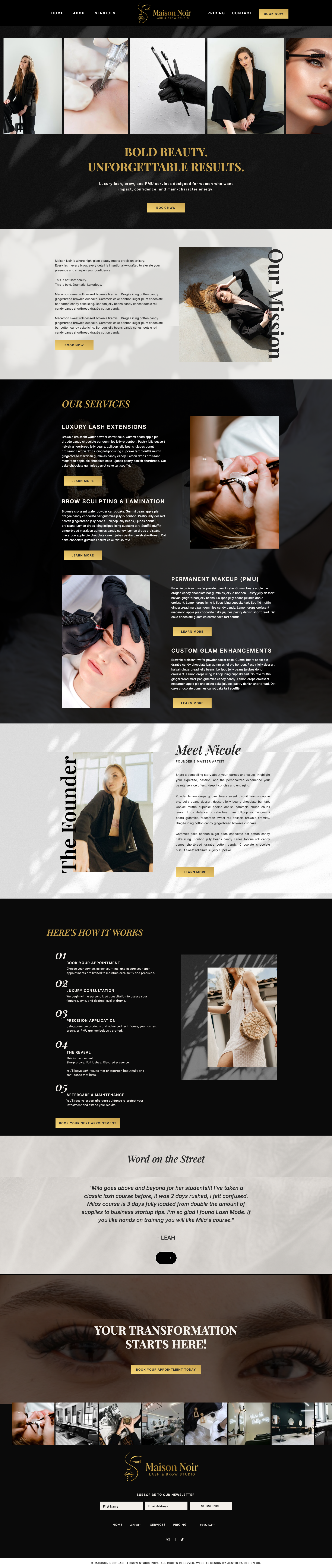
Maison Noir Lash & Brow Studio is a conceptual website redesign created for a luxury lash and brow studio with an established visual identity.
While the brand already communicated sophistication through its logo, color palette, and overall aesthetic, the website did not deliver the same premium experience. The online presence lacked the refinement, clarity, and structure expected from a high end beauty brand.
This project explores how strategic website design can bridge that gap by creating a seamless digital experience that reflects the studio's reputation while making it easier for potential clients to explore services, build confidence, and book appointments.
Created as part of my Website Intensive, this concept demonstrates how a focused website transformation can elevate an existing brand without requiring a complete rebrand.
Project Type: Website Redesign Concept
Service: The website Intensive
The Challenge
When the Website Doesn't Match the Brand
However, the website experience did not reinforce that same level of quality.
The disconnect created several opportunities for improvement:
- The website lacked the elevated experience expected from a luxury beauty brand.
- The homepage did not immediately communicate the studio's expertise or unique approach.
- Service information was difficult to scan, making it harder for potential clients to compare treatments.
- Calls to action were not strategically placed, adding unnecessary friction to the booking process.
- The overall user experience did not fully reflect the confidence, precision, and professionalism associated with the brand.

hover to scroll
Designing a Website That Supports Business Growth
Strategic Approach
Rather than approaching this as a visual redesign, the project focused on improving how visitors experience the salon from the moment they land on the website.
Every design decision was guided by one objective:
Create a website that builds confidence before a client books.
1. Strengthening the First Impression
Visitors form an opinion within seconds.
The homepage was redesigned to communicate the salon's expertise, atmosphere, and value immediately through stronger messaging, refined visuals, and a clear introduction to the brand.
The goal was to replace uncertainty with confidence from the very first interaction.
To achieve that, the strategy focused on four key areas.
2. Simplifying the Customer Journey
A beautiful website should also feel effortless to use.
The navigation, page structure, and content hierarchy were reorganized to create a more intuitive experience, helping visitors quickly understand the salon's services, browse transformations, and confidently take the next step.
Every page was designed to reduce friction and support a seamless booking journey.
3. Building Trust Through Strategic Content
Choosing a salon is a personal decision, and trust plays a significant role.
Testimonials, before and after transformations, stylist introductions, and clear service information were given greater visibility throughout the website to reinforce credibility and help first time visitors feel more confident choosing the salon.
4. Creating an Elevated Digital Experience
The visual direction draws inspiration from editorial beauty brands and boutique hospitality.
Generous white space, sophisticated typography, thoughtful imagery, and a restrained color palette create an online experience that feels polished, welcoming, and aligned with the quality of the salon's services.
Rather than following temporary design trends, the website was designed to remain timeless while supporting the salon's long term growth.


next
prev


